StonePine Capital
A capital management company.
What We Did

Challenge
To design a logo that represents what the company does and also to gain the confidence of the investors from it.
Solution
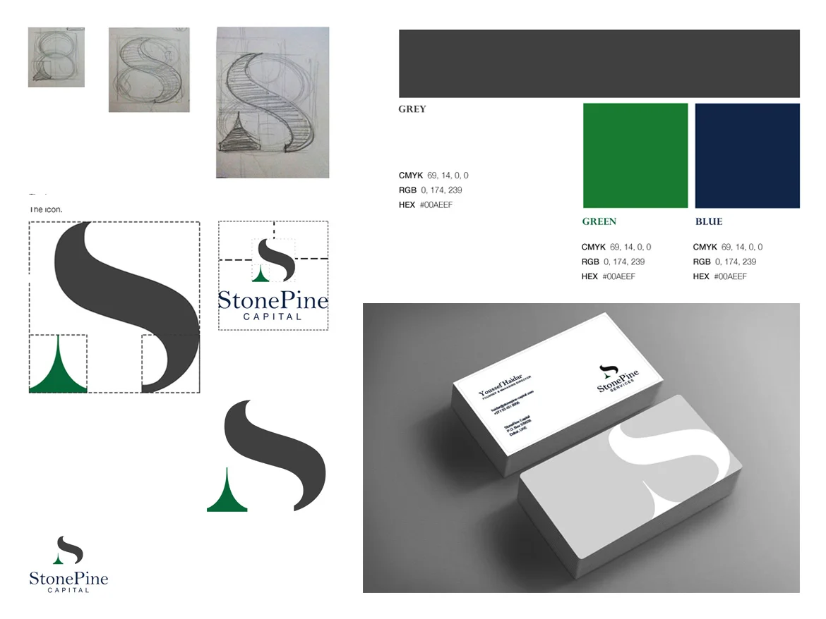
StonePine is a capital management company. In order to meet the challenge, the logo was designed comprising of an arrow in green and an Icon S in grey. The green arrow in the upward direction symbolizes growth and positivity. It is been designed in the shape of a pine tree, as "pine" is a part of the company's name. The font used on the icon "S" is Serif, and it represents class and opulence.


