One Year of Travelling and Living as a Digital Nomad
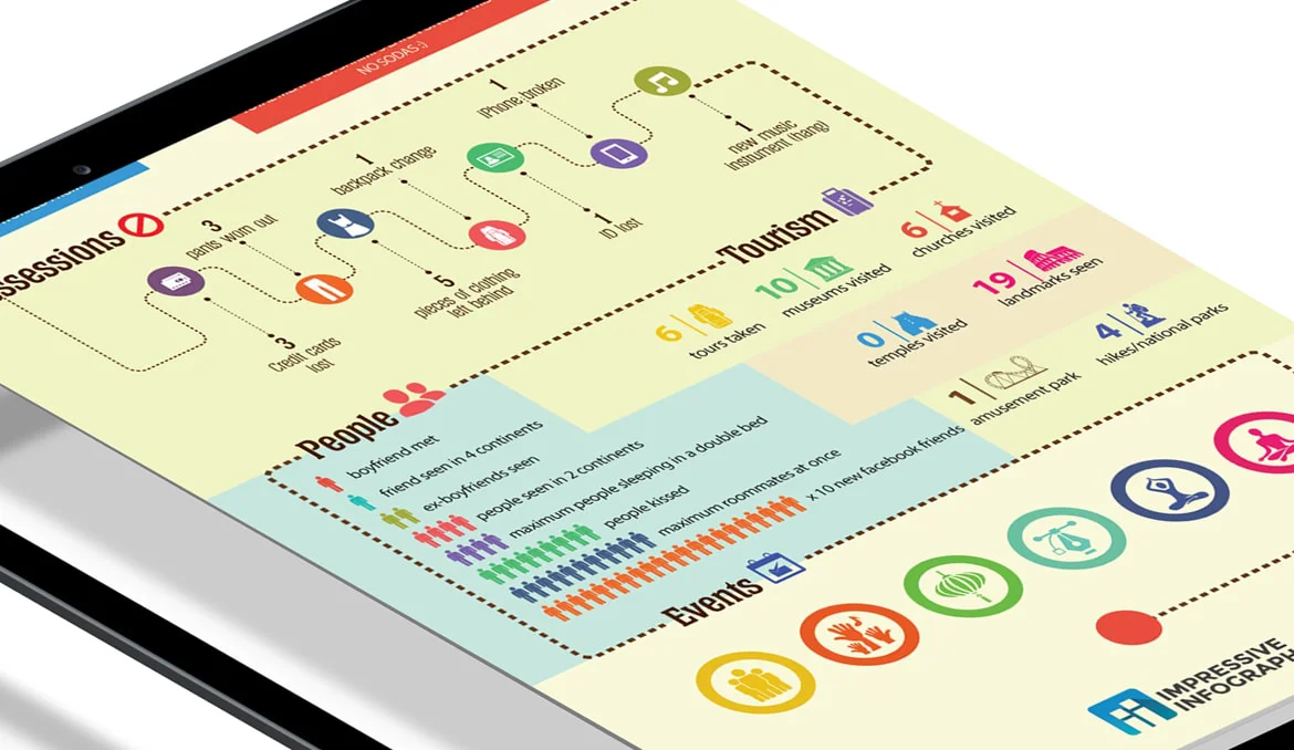
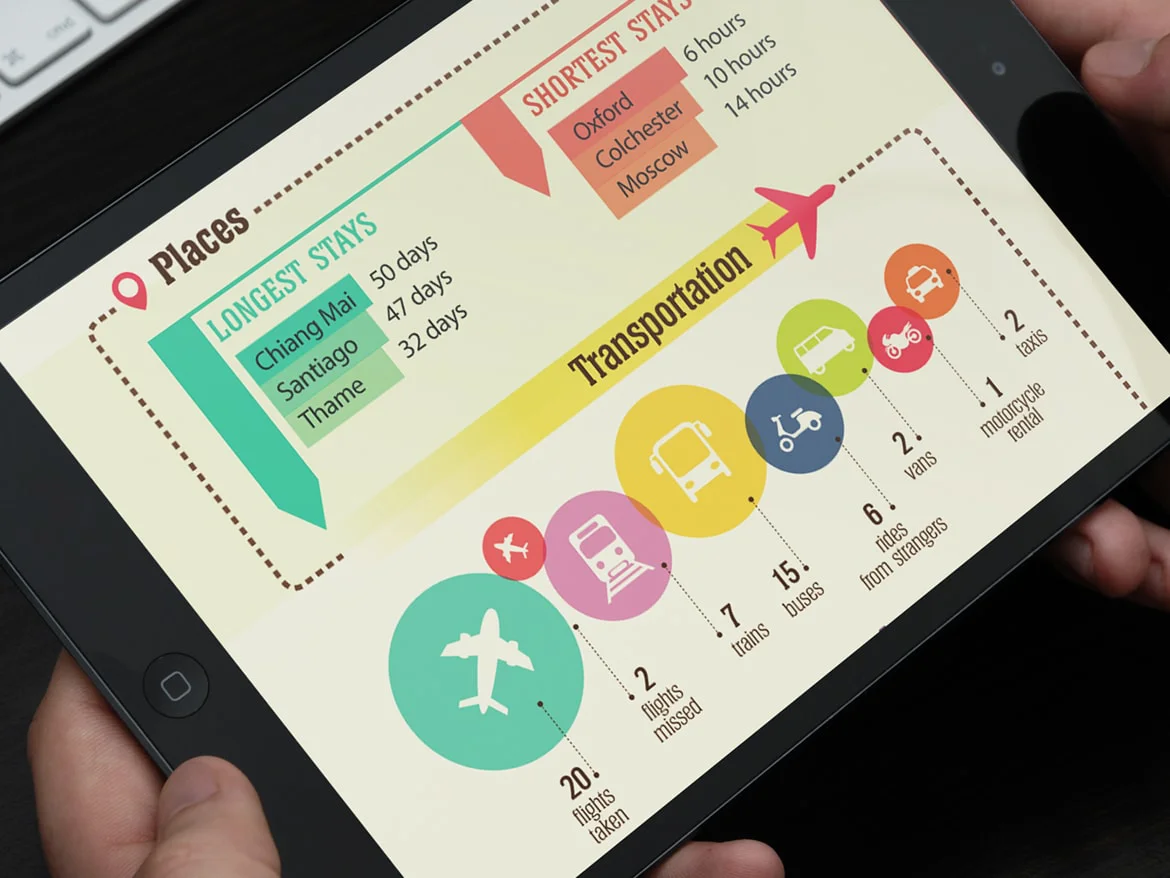
A lot can happen in a year. This is especially true for travelers. So how did we sum up everything that happened in 365 days into one impressive infographic?
What We Did

Challenge
The main challenge was to collate the events that occurred in the span of one year into a digestible infographic without overwhelming the reader. Overall, the infographic needed to be comprehensible at the first read while still sharing the most important details.
Solution
Essentially, we took the typical analytics-heavy infographic style and used the method to measure interesting facts from the life of a traveler. Details such as places lived, hours stayed, and modes of transportation taken were highlighted on the infographic. We used a variety of graphs and visual representations to present numbers and statistics, too!

